
Your next brand identity will turn heads
Consumers judge a brand by its design in 13 milliseconds. That verdict is silent, instant and final. It is based not on your values, your offer or your story, but on what the eye perceives before the brain has time to reason. A brand is more than what it shows. It is judged by the impression it leaves in memory.
Is your brand working against you?
In 1960, Yves Klein patented a colour. Not a work of art; a colour. Sixty-five years later, that blue still bears his name. Klein understood what research now confirms: 78 % of consumers remember a brand’s colour, compared with 43 % who remember its name (Reboot, 2024). Every day your visual identity is not working for you is another day your competitors occupy space in your customers’ minds.
According to Lucidpress, companies that maintain a consistent brand identity across all their channels can see revenue increase by up to 23 % (Lucidpress, 2019). Yet 95 % of organisations have brand guidelines, but only 25 to 30 % actually follow them (Renderforest, 2024). The symptoms are always the same: a logo used differently on each channel, colours that shift from one medium to another, and a tone of voice that changes depending on who is speaking. The brand exists on paper. In practice, it dissolves.
A brand audit is not an aesthetic exercise; it is a strategic diagnosis. We assess the consistency between what your brand promises and what it shows — across your website, social media, print materials, packaging and physical environment. Every gap between intention and perception is identified, documented and prioritised.
We examine every touchpoint: visual identity (logo, palette, typography and imagery), brand architecture (positioning, hierarchy and naming), messaging (tone, key messages and editorial consistency), and experience (website, app, physical materials and customer reception). Each finding is rated by impact and urgency. The deliverable is a roadmap, not a first-impressions report.
You identify what weakens your brand, what strengthens it and what to address first. The audit does not judge your identity: it measures the gap between who you are and how the world sees you.
According to the Stanford Web Credibility Research, 75 % of users judge a company’s credibility solely by its website design. Not by its messaging, its offer or its price, but by what the eye perceives before the brain has time to reason. Art direction determines whether that silent verdict works for or against you.
Directing a brand’s image is not about choosing colours. It is about imposing visual consistency across everything a business presents to the world, from its website to its trade-show stand, from its business card to its packaging, and from a LinkedIn post to a corporate video. Art direction is the invisible thread connecting every medium, allowing a brand to be recognised before its name is read. As Coco Chanel put it, fashion fades; style never does.
We act as an outsourced art director: defining the aesthetic direction (palette, typography, photographic style and illustration style), leading creative teams (graphic designers, motion designers, photographers and videographers), approving every asset before publication, and safeguarding consistency over time. No visual drift, no expedient compromises.
You gain a fully controlled brand image, a visual world your teams can extend without diluting it, and a brand people recognise before they name it. Art direction is not a creative luxury: it is the foundation for everything that follows.
A name can be registered as a trademark within a few weeks. It becomes embedded in contracts, domains and your customers’ memories. Changing it is costly. The cost of renaming is always higher than investing in the right name from the outset.
Naming a brand, product or service is the founding act behind any identity. The name comes before the logo, guidelines and website, and shapes everything that follows. A strong name is memorable, pronounceable, legally available, adaptable internationally and meaningful without being descriptive. The constraints are many. Names that satisfy all of them are rare.
We structure the process: semantic exploration (etymology, sounds, cultural connotations and language registers), concept generation (original creations, neologisms, compounds and creative adaptations), availability checks (INPI, domain names and social media), and perception testing with targeted panels. Every proposal is reasoned, never improvised.
You leave with a defensible, registrable name that is ready to enter the world. Naming is not a creative brainstorming exercise: it is an irreversible strategic act.
Consistent brand presentation across all platforms can increase revenue by up to 23 %, and by as much as 33 % for the most disciplined businesses (Lucidpress/Demand Metric, 2019). Yet most brand identities are created without an architecture: a logo delivered without a system, a tone of voice defined nowhere, and sub-brands left to develop independently. The result is an image that fragments across channels and teams.
Brand architecture is the invisible strategic work that precedes any creative execution. It answers questions design alone cannot resolve: who are we, who are we speaking to, how do we position ourselves, and how do our brands and offers relate to one another? This framework guides every creative decision that follows and prevents contradictions.
We build the complete brand platform: positioning (mission, vision, values and promise), verbal identity (tone, register, key messages and storytelling), portfolio architecture (master brand, sub-brands, ranges and co-branding), and usage guidelines (visual, editorial and brand-territory rules). Every component is documented, structured and transferable.
You gain a strategic foundation that every team — marketing, sales, product and HR — can use without contradicting one another. Brand architecture is not another document: it is the operating framework for your identity.
The human brain identifies an image in 13 milliseconds, well before conscious thought begins (MIT, 2014). Visual judgement comes before rational thought. Your logo, colours, typography and composition are the first words your brand speaks, long before any sales pitch.
Graphic design is not limited to creating a logo. It translates strategy into a coherent visual system: logo, colour palette, typefaces, iconography, illustration style and layout grid. Every component must work both independently and as part of the system, from a smartwatch screen to a construction-site banner. Where others deliver an Illustrator file, we deliver a visual language.
We cover the full visual scope: logo design and variants (horizontal, vertical, monochrome and favicon versions), colour palette and typography, iconography and illustration style, printed materials (business cards, stationery, brochures and posters), and visuals for social media and digital channels. Every element comes with clear usage rules.
You receive a complete, documented visual system that can be extended without losing integrity. Graphic design is not a one-off creative act: it is an asset that works for your brand at every touchpoint.
Every dollar invested in UX generates an average return of 100 dollars — a 9 900 % ROI. A well-designed interface can increase a website’s conversion rate by up to 200 %, or even 400 % when the entire user experience is redesigned (Forrester, 2016).
UI/UX design is not an aesthetic layer placed over a functional website. It is the architecture of the experience — the way a user perceives, navigates, understands and acts through an interface. Page structure, information hierarchy, conversion journeys, micro-interactions and accessibility: every design decision is a business decision. A poorly placed button costs customers. An overlong form drives prospects away. The interface is the salesperson who never sleeps.
We work across the entire digital journey: auditing the existing UX (user journeys, bounce rates and friction points), interface design (wireframes, mock-ups and interactive prototypes), design systems (reusable components and technical documentation), user testing and iteration. Every design is tested using our eye-tracking and attention-prediction tools before delivery.
You get an interface that converts, not merely one that looks good. UI/UX design is not a development cost: it is the most profitable investment across your entire digital ecosystem.
Text is read. Images are viewed. Animation commands attention. In a feed saturated with static content, movement is the one signal the brain cannot ignore.
Motion design is not animated decoration; it is a conversion tool. Logo animation anchors identity, motion UI makes an interface feel seamless, animated social content stops the scroll, and animated infographics make figures memorable. Every format serves a precise business objective. Where others animate to impress, we animate to convert.
We produce across the full spectrum: brand animation (animated logos, transitions and title sequences), animated social content (stories, reels and animated carousels), motion UI (micro-interactions, interface transitions and functional animations), animated infographics and motion graphics packages (titles, lower thirds and animated data visualisation). Every asset follows your brand guidelines and art direction.
Your messages become clearer, more memorable and more engaging. Motion design is not a creative extra: it is the format that turns viewers into customers.
72 % of consumers say they have chosen a new product in-store primarily because of its packaging (Ipsos, 2024). Before the first use, before the first review, before the first recommendation — comes the shelf. And on the shelf, packaging is what sells. Not the specification, the price or the advertising. The packaging.
Packaging design sits at the intersection of three disciplines: branding (translating brand identity onto a three-dimensional object), ergonomics (designing an object people can hold, open and store), and regulation (meeting legal labelling, sector standards and printing constraints). 3D modelling fits naturally into this process: it makes it possible to visualise, test and iterate on packaging before any physical production — through realistic mock-ups, 360° views and in-store visualisations.
We cover the entire process: packaging graphic design (visual structure, information hierarchy and product identity), 3D modelling (photorealistic mock-ups, contextual renders and visual prototyping), multi-product adaptation (ranges, limited editions and formats), and preparation of print-ready artwork. Every design is reviewed in 3D before going into production.
Your product stands out on the shelf before the consumer has even touched it, and your brand identity extends all the way into the customer’s hands. Packaging is not the final link in the chain: it is your product’s first silent salesperson.
Turning perception into brand preference
Three identities designed to elevate perception, strengthen preference and support commercial performance.
Building and expressing a luxury experience through design
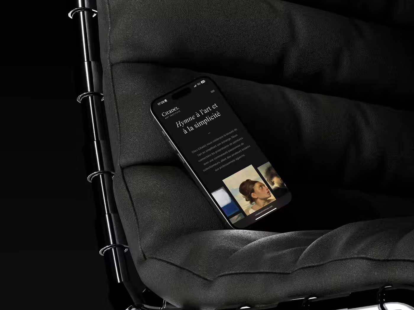
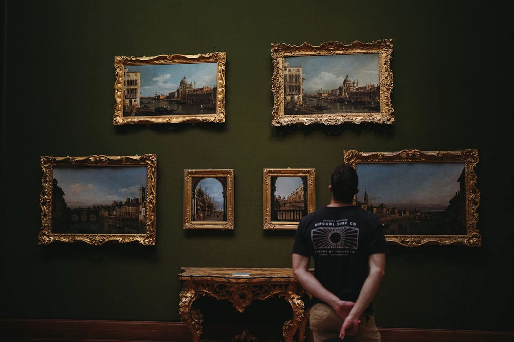
For Citadel Art Institute, Logiks created a premium identity and a restrained digital experience that elevates the artworks without ever overwhelming them.
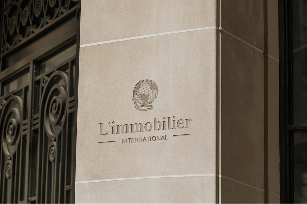
23 qualified seller enquiries after a complete brand and website redesign
Founded in Paris in 2000 by Christian Hesse, L’Immobilier International acts on behalf of BNP Paribas, Groupe La Française and several institutional property companies. The agency had built a 23-year track record, but its online presence spoke the visual language of another era. Logiks led the brand and website redesign, structured the commercial proposition and created a dedicated seller journey. The website now generates around twenty inbound seller mandates a year through organic search alone—the equivalent of €35,000–€50,000 in annual acquisition-cost savings.
Google traffic up 10.3× in three months, direct margin restored and four-star status secured
A complete website redesign increased Google traffic 10.3-fold in three months, improved the average ranking from 15th to 5th in a fiercely competitive market, reduced dependence on Booking.com and other platforms, and secured every website-related point required by Atout France for four-star classification. The result: restored direct margin and a stronger classification application.
Explore Logiks insights and our in-depth articles
Explore in-depth articles written by our experts.