




Branding & design
Web development

23 qualified seller enquiries after a complete brand and website redesign

Founded in Paris in 2000 by Christian Hesse, L’Immobilier International acts on behalf of BNP Paribas, Groupe La Française and several institutional property companies. The agency had built a 23-year track record, but its online presence spoke the visual language of another era. Logiks led the brand and website redesign, structured the commercial proposition and created a dedicated seller journey. The website now generates around twenty inbound seller mandates a year through organic search alone—the equivalent of €35,000–€50,000 in annual acquisition-cost savings.
Client
L’Immobilier International
Date
2024
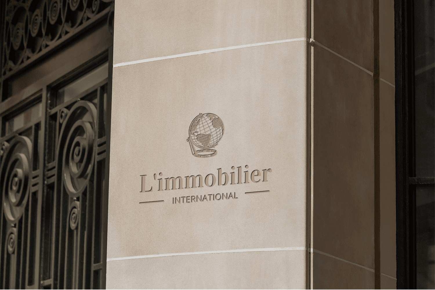
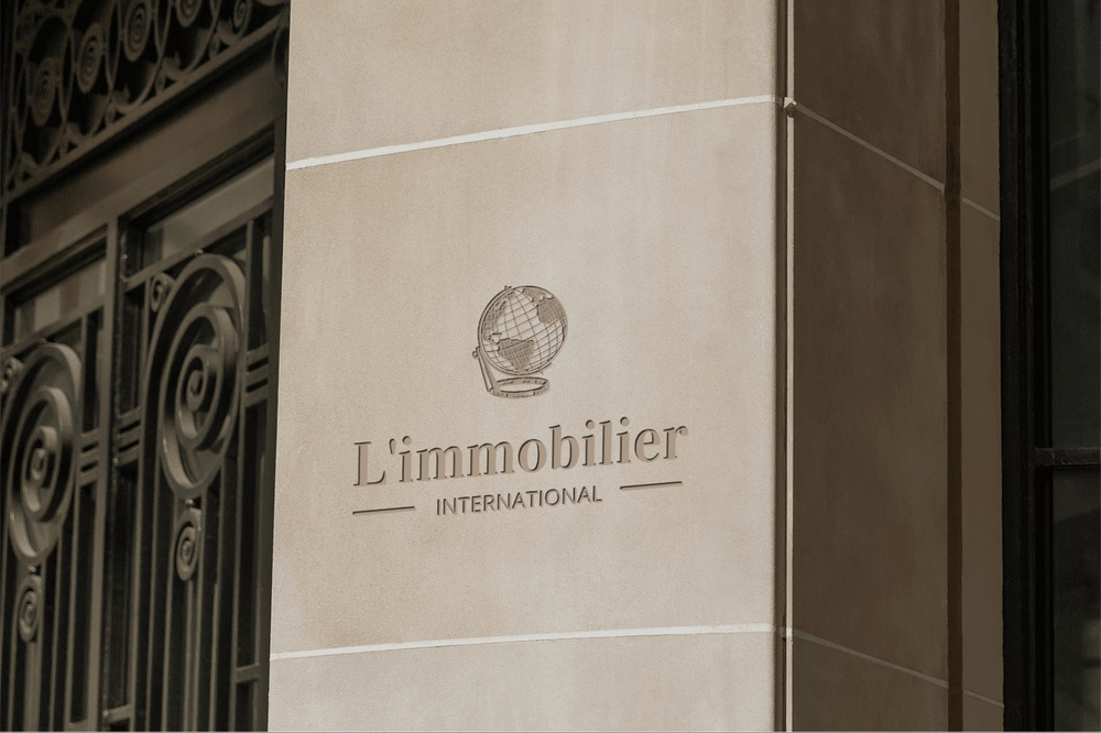
Façade displaying the L’Immobilier International logo.
In summary

Project overview

The challenge

Turn existing traffic into qualified seller enquiries for a high-end agency whose online image no longer reflected 23 years of expertise.

Our work

Redesign the logo and brand expression, rebuild the commercial proposition and create a seller journey centred on trust.

The result

23 qualified seller enquiries in 2025, with no additional advertising—the equivalent of €35,000–€50,000 in avoided acquisition costs each year.

01 — Context

Context

Founded in Paris in 2000 by Christian Hesse, L’Immobilier International acts on behalf of BNP Paribas, Groupe La Française and several institutional property companies. The agency had built a 23-year track record, but its online presence spoke the visual language of another era. Logiks led the brand and website redesign, structured the commercial proposition and created a dedicated seller journey. The website now generates around twenty inbound seller mandates a year through organic search alone—the equivalent of €35,000–€50,000 in annual acquisition-cost savings.
02 — Challenge

The challenge

In Paris’s prime-property market, competition is driven less by the property itself than by trust. The owner of a seven-figure Haussmann apartment, a private mansion in the 7th arrondissement or a wine estate in Burgundy does not choose an agency on price. They choose it for its hallmark, institutional credentials and authority of expression.

Founded by Christian Hesse in 2000, L’Immobilier International had precisely the assets required to earn that trust: twenty-three years in business; active partnerships with BNP Paribas, Groupe La Française and several institutional property companies; and specialist expertise in exceptional French vineyards developed since 2013. It was a reference agency that could have met every expectation in its segment—except one.

Online, the agency presented a very different image. Its logo and website dated from the early 2000s, its visual world had been left behind by two decades of change, and its commercial narrative no longer articulated the agency’s true promise. The digital brand had become a silent handicap, widening the gap—touchpoint by touchpoint—between the agency’s real value and the value prospects perceived.

In this market, acquiring a qualified seller enquiry through paid channels can quickly cost anywhere from several hundred to several thousand euros once Google Ads, lead platforms, sales time and the sector’s actual conversion rates are included.

An independent agency without the advertising budgets of major luxury names such as Daniel Féau, Émile Garcin, Sotheby’s and Barnes will inevitably lose ground—unless it builds a digital asset capable of capturing organically what others pay a premium to acquire.

The challenge was therefore not merely aesthetic. It was to realign the digital brand with the agency’s true standing and establish a commercial narrative that converted visits into valuation enquiries.

03 — Solution

The solution

The project focused on the two dimensions that genuinely matter in this business: trust and conversion. No heavy technical rebuild and no sprawling programme of features—just a targeted rebrand, a reconstructed commercial proposition and rapid design execution to put both to work in the real world.

  • Stage 1. Redesign the image to reflect what the agency had become.

    The visual diagnosis was precise: the agency did not lack an identity; its identity had simply fallen behind the times. The work began with the gesture that structured everything else: redesigning the logo. Inherited from the early 2000s, the old mark had become an unmistakable sign of its generation. Awkward typography, an outdated signal of authority and poor legibility on modern screens all worked against the business.

    The new identity followed a simple principle: typographic restraint, a clear hierarchy between the brand and its profession, and a colour palette aligned with the visual codes of leading agencies in the market. The result was a hallmark worthy of the institutional partnerships the agency had cultivated for twenty-three years.

    Beyond the logo, we rebuilt the agency’s visual foundations. We redesigned the colour palette, selected a typeface that conveyed institutional credibility without coldness, calibrated photography to the register of prime property rather than a neighbourhood estate agency, and presented properties editorially as works rather than listings.

    The objective can be expressed in one sentence: a visitor arriving on the website should recognise, within the first second, an agency that works with institutional property companies and owners of private mansions.

  • Stage 2. Rebuild the commercial proposition around real sellers.

    This work produced the measurable difference. We restructured the message hierarchy, aligned the vocabulary with the target audience (institutional owners, expatriates and sellers of wine estates), and introduced trust signals at the right points in the journey: a prominent Trustpilot score (4.9/5), named institutional references (BNP Paribas and La Française), a signed letter from founder Christian Hesse, and visible profiles of the team and strategic committee.

    Sellers arriving on the page no longer have to infer who they are dealing with. They know.

  • Stage 3. Execute the design rapidly to bring the new brand to market.

    The rebrand and commercial proposition had value only once they were live. The front-end redesign was therefore run as a tightly focused project: no heavy technical work and no new functionality. It was a pure design intervention covering the home page, page hierarchy, presentation of properties and end-to-end visual consistency.

    This reflected the project’s underlying logic: the commercial lever lay in the brand and the narrative, not in the technical layer. A simple execution, delivered quickly, was enough to put the renewed agency to work in the real world.

04 — Impact

The impact

  • Twenty-three qualified seller enquiries in 2025, compared with almost none before the redesign.

    With traffic broadly comparable to pre-redesign levels, the website now captures around twenty qualified seller enquiries a year that align with the agency’s positioning. No Google Ads, paid lead platform or sponsored editorial partnership was used. SEO was deliberately not selected as the growth lever: in the Paris property market, organic acquisition requires substantial investment that the agency did not wish to make.

    Instead, the new brand and commercial proposition convert existing visitors into enquiries—evidence that the commercial lever lay in the narrative, not the channel.

  • The equivalent of €35,000 to €50,000 in acquisition spend avoided each year.

    Using a conservative estimated acquisition cost of €1,500 to €2,200 per qualified seller enquiry in the prime Paris market, the twenty-three enquiries captured organically in 2025 represent €35,000 to €50,000 in equivalent acquisition budget that the agency never had to spend. Over three years, the cumulative saving approaches €100,000.

    For an independent agency without the marketing resources of the major luxury brands, this is the difference between being subjected to competition and holding one’s own.

  • Restored proof of brand.

    Sellers arriving on the website immediately recognise an agency that works with institutional property companies, can point to twenty-three years of experience and commands a clearly defined segment. Christian Hesse’s personal hallmark, the institutional references, the redesigned logo and the digital touchpoint at which owners decide whether to entrust the agency with their property now tell a coherent story.

L’Immobilier International demonstrates what a website can become for an independent prime-property agency when treated as a positioning asset rather than a brochure. Built well, it attracts the right clients and filters out the wrong ones. In this context, digital is no longer a volume channel; it is a quiet growth engine, operating day and night at zero marginal cost once the brand investment has been absorbed.

A rebranding project that touches an agency’s identity requires a particular quality from the client: a willingness to question what has already been built and the decisiveness to make choices quickly. Christian Hesse was that kind of partner. We thank him for his trust and for the quality of the collaboration.

The art of turning ideas into digital realities

Explore our portfolio and imagine what we could achieve together to take your online presence to new heights.

Your competitors
will be left behind