

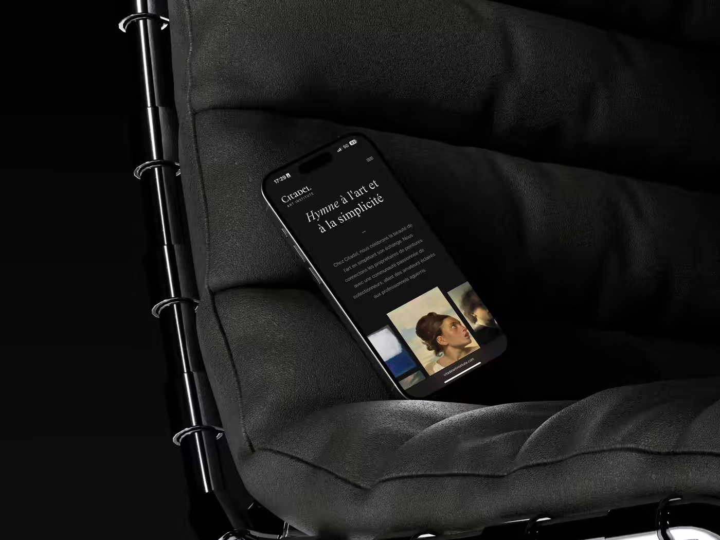
A screen can be sleek and still be difficult to use. The UX/UI design does not serve to embellish an already decided path: it reduces the gap between what the user wants to achieve, what the company must achieve and what the interface actually allows.
1. The useful distinction between UX and UI
Theuser experience (UX) covers how a person understands, experiences and evaluates a service: promise, information, steps, effort, errors, trust, channels and operational suites. Theuser interface (UI) translates this experience into a visual and interactive system: hierarchy, components, states, typography, colors, movement and responsive behavior.
The “UX before UI” formula oversimplifies. A visual hierarchy modifies understanding; a technical component constrains the route; a business rule changes the experience. Both disciplines work in a loop with content, product, development, data, accessibility and operations.
The result is therefore not a collection of models. It’s a journey that’s understandable, achievable, measurable, and robust enough for its real users — including when data is missing, the network slows down, or an error occurs.
2. Key figures: frictions are neither marginal nor only aesthetic
| Data | Scope and source | What she really says | Design decision |
|---|---|---|---|
| 70,22 % | Average of 50 cart abandonment studies, calculated by Baymard en 2025. | Much abandonment is natural; the gross rate alone does not measure the quality of the checkout. | Segment the controllable causes before promising a conversion gain. |
| 18 % | Buyers surveyed who abandoned because the checkout seemed too long or complex, Baymard. | Perceived complexity matters as much as the objective number of steps. | Test comprehension, effort and recovery on mobile with real fields. |
| 11 777 participants | Nine quantitative studies integrated into the checkout corpus of Baymard. | The recommendations are based on several methods; they remain to be validated in the specific context. | Use benchmarks as hypotheses, then measure the actual journey. |
| 2 700+ issues | Usability incidents observed during 272 checkout test sessions, Baymard. | Even big brand interfaces accumulate real-world friction. | Have the tasks tested, not just comment on the screens in meetings. |
| 1 person on 5 | People declaring a permanent disability in the United Kingdom, reminder of GOV.UK Service Manual. | Accessibility concerns a significant part of the public, to which are added temporary and situational constraints. | Include people with disabilities in the research and recipe. |
| 56,1 errors/page | Accessibility errors detectable on average on one million home pages, WebAIM 2026. | Automation reveals some of the barriers; it does not prove compliance. | Combine scanner, inspection, keyboard, assistive technologies and user tests. |
| 83,9 % | Pages with insufficient contrast text in WebAIM Million 2026. | Contrast remains a massive defect, often created or validated in the visual system. | Verify actual color/size/condition pairings before publishing palette. |
| 33,1 % | Form fields without correct label in the same corpus WebAIM. | A form can appear clear visually while being ambiguous for assistive technology. | Set label, help, error, success and focus in each component. |
| 2,5 s / 200 ms / 0,1 | “Good” thresholds for LCP, INP and CLS at the 75e percentile, web.dev. | Experienced quality includes loading, responsiveness and stability, measured in the field. | Add performance budgets to UI criteria, especially for media and scripts. |
| 48 % | Mobile experiences passing the three Core Web Vitals in 2025, against 36 % in 2023, HTTP Archive. | The Web is progressing, but more than half of the CrUX scope observed still does not pass the three thresholds. | Design and test on realistic devices and connections, not just on the designer's station. |
These results do not allow us to write “good UX increases conversion by x%”. Commerce, price, traffic, brand and operation influence the result. On the other hand, they show that observable errors are frequent and that a proof approach costs less than aesthetic certainty.
3. The friction file: starting from an event, not a screen
Imagine a B2B quote. The marketing team sees a lot of visits and few requests. The director wants to shorten the form. The salesperson, on the contrary, requires more qualification. The developer points out that some fields come from the CRM. The designer offers a three-step form.
Four solutions appear before the problem is established.
The friction file begins differently. It brings together the intent of the page, the traffic source, the entry rate, the progression field by field, errors, time, abandonments, requests received, their qualification, support feedback and some observed sessions. We sometimes discover that the form is not the problem: the offer remains unclear, the proof arrives too late or the commercial response time destroys trust after sending.
This investigation avoids local optimization. The experience crosses the site and the organization.
4. Five levels of proof to design a web journey
4.1. Level 1 — Understand the user's work
The research is not intended to ask people which interface they want. It seeks to understand a situation: trigger, objective, current stages, available information, constraints, workarounds, confidence criteria and cost of failure.
The sources complement each other: interviews, observation, support tickets, sales calls, internal research, analytics, surveys and accessibility feedback. Five interviews does not statistically represent a deal. However, they can reveal patterns of behavior and issues that aggregated data masks.
The GOV.UK Service Manual recommends starting with the needs and treating the opinions of stakeholders as hypotheses until they are confronted in the field. The method is also suitable for private companies: a hierarchical request is not user proof.
Search output: research note, priority situations, map of the current route, risks of exclusion, inventory of evidence and still open questions. Decorative personas are not required.
4.2. Level 2 — Give an architecture of your choice
Information architecture decides what is grouped, named, ordered and made accessible. It starts from the questions and objects that users are looking for, then relates them to the company's capabilities.
You can test a tree structure with card sorting, a tree test or tasks on a low-fidelity prototype. The objective is not to have the menu voted on. It is to verify that the terms are orienting and that people find the path without knowledge of the organization chart.
Content comes in here. A “Learn More” CTA doesn’t reveal the destination; a generic title does not allow comparison; non-contextualized proof does not reassure. Content design and UX are the same conversation in two different mediums.
Architecture output: content model, argument tree, nomenclature, critical paths, navigation rules and proof content.
4.3. Level 3 — Make errors visible in the prototype
A journey wireframe should show more than the ideal case. It covers at least: empty field, invalid value, data already known, interrupted step, expired session, server error, absence of result, success, confirmation and possibility of returning.
Test an entire task with plausible data. The person must understand where they are, what is being asked, why, how to correct it, and what will happen next. Timing alone is insufficient: a task completed quickly but misunderstood can generate a costly business error.
The protocol specifies the scenario, the success criteria and the points the team seeks to learn. The facilitator does not defend the model. He observes what the interface allows without assistance.
Useful deliverables: testable prototype, scenarios, observation log, decisions made and problems left open.
4.4. Level 4 — Transform the UI into a behavior system
The visual direction must serve the hierarchy and the brand, but a UI system goes further. Each component has a use, expected content, variants, states, responsive rules, accessibility requirements and an associated implementation.
A button is not limited to three colors. You must specify the wording, importance, focus, hover, activation, loading, deactivation, width, icon and reaction to long text. A modal requires trigger, initial focus, close, return focus, keyboard behavior and alternative if content becomes dense.
The GOV.UK Design System combines automated testing, manual testing and research with people with disabilities. This combination is the right unit of quality: the documented, implemented, and proven component — not its rectangle in Figma.
Useful deliverables: visual foundations, component library, usage documentation, high fidelity prototype, responsive specifications and exception inventory.
4.5. Level 5 — Check service after going live
The launch finally allows us to observe real behavior, field performance and operational effect. You must have created a reference state before the overhaul and instrumented significant events.
Three families of measurements protect easy conclusions:
- result: purchase, qualified request, activation, resolution, time or cost;
- experience: task success, progress, errors, feedback, contextual satisfaction;
- guardrails: accessibility, performance, tickets, cancellations, fraud, support costs.
A higher click-through rate is not a success if requests become less relevant. An apparent conversion may result from a change in traffic. To attribute an effect, use volume-based contextualized before/after comparison, A/B testing, phased deployment, or repeated qualitative research.
Useful deliverables: measurement plan, journey dashboard, improvement backlog, monthly review and decision register.
5. Tests, errors and prototype: the review that avoids false validation
The review doesn't ask "do you like this page?" ". She gives a task. She observes a result. She records the hesitations.
Before a direction validation, show at least one happy case, a long data, no result, a recoverable error and a blocking error; this selection reveals the maturity of the course much better than three aesthetic variations of the home page.
The decision log then distinguishes between the observed fact, the interpretation, the arbitrage and the accepted risk. Short, but decisive. This trace prevents a late expressed preference from presenting itself as user learning and gives development the necessary context when a technical compromise arises.
6. Adapt the method to the risk, not to the prestige of the project
| Context | Minimum credible research | Prototype level | Validation before launch |
|---|---|---|---|
| Low Risk Editorial Page | Analytics, research, content and some targeted interviews. | Responsive content/wireframe. | Proofreading, accessibility, SEO and performance. |
| B2B lead generation | Lead analysis, sales calls, proposal tests. | Complete walkthrough with errors and confirmation. | Tasks, tracking, CRM, quality of requests. |
| E-commerce checkout | Funnel data, support, sessions, contextual benchmark. | High fidelity mobile with payment and recovery. | Usability, accessibility, performance, payment and fraud. |
| Daily business application | Work observation, exceptions and error costs. | Interactive prototype on real cases. | Driver, rights, data, continuity and training. |
| Regulated or critical service | Inclusive research, legal expertise and risk analysis. | Simulation of happy and degraded paths. | Formal testing, auditing, traceability, security and recovery. |
The light method is not an absent method. It chooses the least expensive evidence capable of reducing the dominant risk.
7. Costs, deadlines and responsibilities
The UX/UI budget depends less on the number of screens than on the number of situations to understand, roles, states, linked systems, languages and levels of proof. A complex but static page may require less work than a short form with ten business exceptions.
A complete estimate separates: research, architecture/content, prototyping, testing, UI direction, components, specifications, development support, QA design and measurement. It also specifies who recruits participants, provides data, decides the rules, validates accessibility and maintains the system.
Logiks benchmarks, non-statistical: two to three weeks may be enough to frame a compact course when the knowledge exists; four to eight weeks are often suitable for a research-prototype-test cycle; a complex product requires several cycles throughout delivery. Compressing the schedule is possible by reducing the scope tested, not by pretending that the research or recipe has taken place.
| Actor | Decisive responsibility | Proof of completion |
|---|---|---|
| Sponsor / product owner | Result, priority, rules and arbitrages. | quick decisions, measurement and acceptance criteria. |
| UX/research | Problems, paths, tests and synthesis. | Traceable observations and recommendations linked to evidence. |
| Content design | Understanding, order, messages, errors and help. | Contents tested in real components. |
| UI / design system | Hierarchy, states, consistency and specifications. | Components documented and verified in implementation. |
| Development | Actual behavior, performance and compatibility. | Testable version, complete states, instrumentation and corrections. |
| Data / CRO | Measurement, event quality and attribution. | Baseline, taxonomy, QA and contextual reading. |
| Accessibility | Method, manual tests and assistive coverage. | Results, gaps, priorities and counter-tests. |
8. What a good service UX/UI should deliver
Beware of two extremes: the hundred-page file that is never proofread and models without reasoning. The deliverables must enable a decision or production.
At the end, the team should have a formulated problem, prioritized paths, representative content, a prototype covering errors and rework, test results, a proportionate UI system, acceptance criteria, a measurement plan and an ordered backlog. Source files, rights, conventions and maintenance responsibilities must be transmitted.
Quality is verified in the integrated product. Design QA compares behavior, content, responsiveness, focus, performance and states — not just pixel alignment.
9. Logiks Tips: Recognizing Fake UX
- The team speaks of “the user” in the singular without showing a recent observation.
- The search begins after choosing the solution.
- The prototype contains no errors, no waits, no long data.
- All problems are solved by a new feature.
- The design system is growing while no team owns it.
- Accessibility is entrusted to a plugin or to an audit just before launch.
- Success is reduced to the conversion rate without commercial quality or safeguards.
- The service provider delivers Figma but not the decisions, test results and rules of use.
Our position: Ask for fewer demo screens and more evidence of when someone hesitates, makes a mistake, or gives up.
10. Action plan on 60 days
10.1. Weeks 1 and 2 — Building the friction case
- choose a task and a business measure;
- bring together data, support, commerce and content;
- observe or question priority profiles;
- map pathways, constraints and exclusions;
- name the riskiest unknowns.
10.2. Weeks 3 and 4 — Test the structure
- prototype with real messages;
- include errors, empty states and recovery;
- test tasks on mobile and keyboard;
- arbitrate the rules with product and operations;
- document what is changing and why.
10.3. Weeks 5 to 8 — Putting the System to the Test
- finalize hierarchy and necessary components;
- support the implementation;
- execute design QA, accessibility and performance;
- accept measurement events;
- gradually open and launch the improvement loop.
11. FAQ
11.1. What is the difference between UX design and UI design?
UX organizes the service, the journeys, the information, the efforts and the evidence. The UI materializes hierarchy and interactions in a visual system. Both overlap and need to work with content and development.
11.2. How much does a UX/UI mission cost?
The cost varies depending on the research, the number of situations and roles, the prototype level, the tests, the UI system and development support. Compare services on their evidence and coverage, not on a price per screen.
11.3. How many users should you test?
There is no universal number. A few sessions can reveal major problems in a qualitative cycle; they do not measure their frequency in the population. Repeat testing on separate profiles and risks, then use quantitative data when estimation is necessary.
11.4. Is a design system still necessary?
A consistent set of styles and components is necessary. A complete platform with dedicated governance is not always. Start with the elements actually used, document the rules, and only create heavier infrastructure when multiple teams benefit from it.
11.5. How to measure the ROI of design?
Link a friction to a business metric, create a baseline, deploy a traceable change and monitor results, experience and safeguards. Design contributes to the result with traffic, offer, price, technique and operations; avoid attributing any variation to it alone.
11.6. Does accessibility limit creativity?
It imposes criteria of use, not a uniform aesthetic. Contrast, focus, structure, alternatives and control of animations require more precise design. A creative direction remains possible if the system foresees its real uses.
12. Conclusion
The UX/UI background design doesn't just deliver looks. It turns assumptions into tested journeys, visual choices into documented behaviors, and goals into verifiable metrics.
Value appears when the team knows how to explain what friction it reduces, for whom, with what evidence and without shifting the cost elsewhere. The interface then becomes a decision-making tool, not a decoration validated by committee.
13. Main sources
- Baymard Institute — Cart abandonment rate statistics, updated September 2025.
- Baymard Institute — Reasons for cart abandonment, data 2025.
- Baymard Institute — How to reduce cart abandonment, accessed on July 13 2026.
- GOV.UK Service Manual — How the discovery phase works, accessed on July 13 2026.
- GOV.UK Service Manual — Start by learning user needs, accessed on July 13 2026.
- GOV.UK Design System — Accessibility strategy, accessed on July 13 2026.
- WebAIM — The WebAIM Million 2026, February 2026.
- web.dev — How the Core Web Vitals thresholds were defined, updated May 2025.
- HTTP Archive — Web Almanac 2025, Performance, published in 2026.
- W3C — Web Content Accessibility Guidelines 2.2, W3C recommendation.